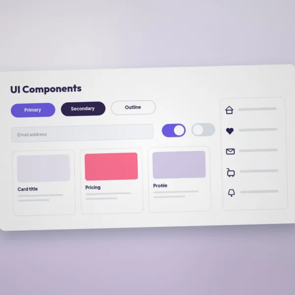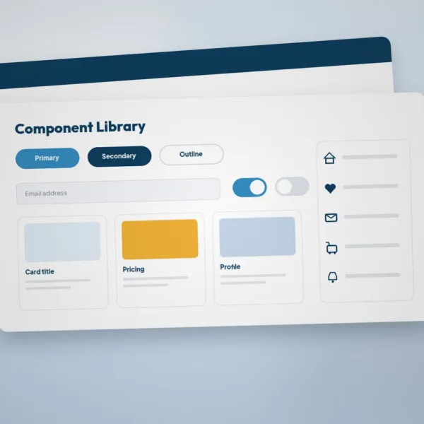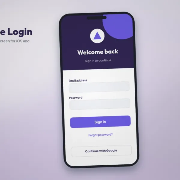

Design once, look great everywhere. These responsive page sections are shown on desktop, tablet and phone, with layouts that adapt cleanly to every screen size.
What is included
- Desktop, tablet and mobile layouts
- Reusable sections
- Editable components
- Help file
Specifications
- Desktop and mobile layouts
- Reusable components and auto layout
- Editable text, colours and images
- Organised, named layers
Perfect for
Web designers, agencies and developers.
How to edit
Open the file in the listed software, replace the placeholder text, images and logo with your own, adjust the colours to match your brand and export the final file for print or screen.